
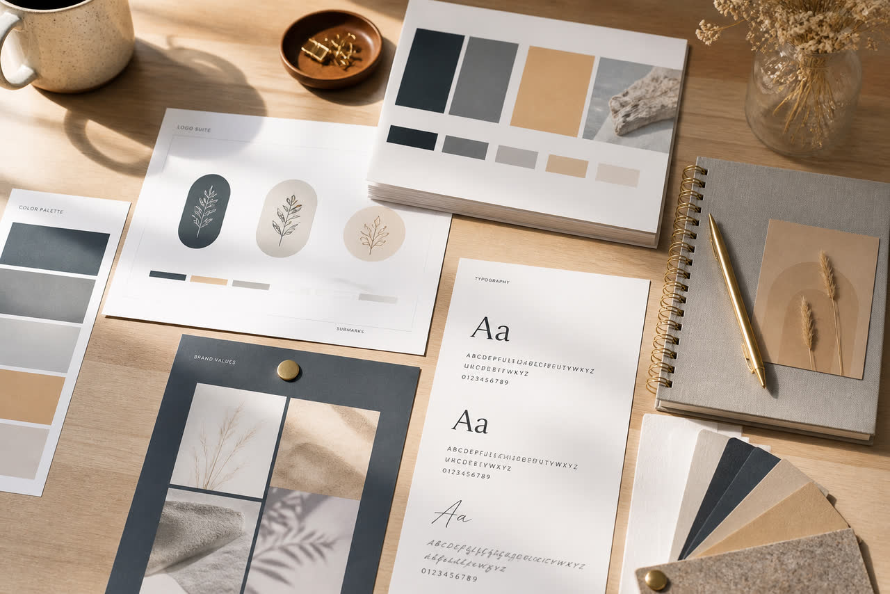
A brand kit for video creators does not need to look like a corporate style guide with fifty pages of unused rules. It needs to answer practical questions before you open an editing project: which logo file is current, which colors are allowed on screen, which fonts appear in titles and lower thirds, how the channel should sound in a short voice note, and how collaborators should name and share those assets without chaos. When those answers live in one small folder, every intro, thumbnail, end card, and social cutdown starts from the same foundation. When they do not, you slowly invent a new temporary identity on every upload, and viewers feel the drift even if they cannot explain it.
Start with logo files that survive editing, not just design
Collect one master logo in a vector format when possible, plus a transparent PNG large enough for 4K timelines. Keep a simplified mark for tiny placements, end cards, and mobile crops. Store a dark version and a light version so editors do not invent emergency recolors under deadline. Write a one-line note about clear space and minimum size so the mark does not get crushed beside busy footage. If your logo includes a wordmark, also keep a stacked layout and a horizontal layout; video frames and thumbnails rarely share the same proportions. Archive old logos in a dated folder instead of overwriting them, because you may need the previous mark for older episode packaging or sponsorship stills.
Name files so a stranger on your team can find the right one in seconds. Prefer readable names like channel-logo-primary-light.png over final-final-v7. Avoid packing every variant into one layered mystery file with no export notes. If an editor asks which file is approved, the answer should be a path, not a scavenger hunt through chat history. This small operational habit protects consistency better than another aesthetic debate about gradients.
Lock a short color system and use it everywhere
Most creator channels need fewer colors than they think. Choose one primary accent, one secondary accent, a neutral dark, a neutral light, and optionally one highlight for warnings or calls to action. Store hex values in a plain text note inside the kit. Apply the same accents in thumbnails, intro end frames, subscribe reminders, and community posts so the channel reads as one product. Resist adding a new trendy color every time a template looks exciting; temporary excitement is how brand kits die. If you collaborate with designers, ask them to work from the kit rather than from a screenshot of last week’s thumbnail.
Test colors on phone screens and against real footage, not only on a design canvas. High saturation that looks premium on a calibrated monitor can scream on mobile or clash with skin tones. If your niche is calm education, softer accents usually support trust better than neon frames. If your niche is high-energy gaming or sports, stronger contrast can work, but still keep the palette countable. Consistency of palette helps returning viewers recognize your uploads in a crowded home feed before they even read the title.
Choose fonts for motion and thumbnails, then stop shopping
Pick one display font for big titles and one readable font for supporting text. Confirm licensing allows commercial video use and social export. Check legibility at thumbnail size and inside a five-second intro settle. Avoid pairing three decorative families because the result usually feels busy rather than branded. Document fallback fonts for collaborators who do not own the same licenses. Once chosen, reuse the pair across intros, end cards, chapter titles, and short-form overlays so typography becomes part of recognition, not a weekly experiment.
Add voice notes that define tone, not scripts
A useful brand kit includes a short voice note describing how the channel should feel: calm teacher, sharp reviewer, warm storyteller, energetic coach. Record thirty to sixty seconds explaining what to avoid as well, such as sarcasm, hype language, or corporate buzzwords. This helps editors choose music beds, sound stings, and on-screen copy that match your speaking style. It also prevents a polished intro from sounding like a different personality than the host who appears ten seconds later. Keep the note updated when your positioning changes, and store it next to logo and color files so it is hard to miss.
If you publish on YouTube and also reuse clips elsewhere, write one paragraph about platform differences without inventing separate brands. The same identity can adapt to vertical framing and shorter hooks while keeping colors, logo behavior, and tone intact. Official upload and format guidance from YouTube is available at https://support.google.com/youtube/answer/6373554 and can help you plan which masters belong in the kit. Creators who later publish supporting web pages often keep the same clarity in about text and policies; Google’s AdSense overview at https://www.google.com/adsense is a reminder that clear ownership and consistent presentation matter beyond the video player itself.
Name files, share folders, and protect consistency across platforms
Create a simple folder tree: logos, colors, fonts, voice, intros, thumbnails, and archives. Use dates in ISO style when versioning, such as 2026-08-17-intro-master.mov. Share the kit through one living location rather than attaching random exports in private messages. When a new editor joins, send the kit first and a two-minute walkthrough second. Ask them to confirm which intro master, color hex list, and font pair they will use before the first delivery. This reduces the expensive moment where a beautiful edit arrives with the wrong logo crop and an unapproved neon outline.
Consistency across platforms does not mean identical layouts. It means the same recognition cues: logo shape, accent color, typography mood, and sonic identity when audio is present. Check your channel banner, video watermarks, community images, and short-form covers against the kit once a month. If something drifted, fix the source files instead of patching one upload. Study audience retention when you change branded opens so you know whether recognition is helping or delaying the hook; YouTube explains retention analysis at https://support.google.com/youtube/answer/9314356. A simple brand kit will not make average content brilliant, but it will stop packaging from fighting itself, and that alone makes a channel feel more deliberate to viewers who discover you through search, suggestions, or shared links.