
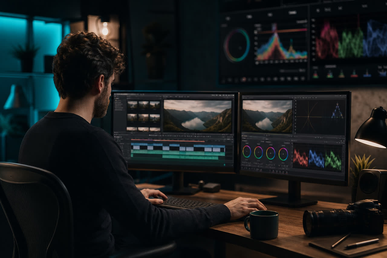
Color grading is one of the fastest ways to make a YouTube channel feel intentional, and one of the easiest places for creators to waste hours chasing aesthetics that hurt clarity. Viewers rarely pause a video to admire your teal shadows. They do notice when skin looks sickly, when white shirts glow neon, when night scenes turn into gray mush, or when every upload seems shot under a different light. Grading is not magic dust you sprinkle at the end. It is a sequence of decisions that starts with how you light and expose, continues through a clean base correction, and ends with a restrained creative look that matches your niche. If you treat the grade as a costume change every week, your brand becomes harder to recognize. If you treat it as a stable system, color becomes part of how people remember your channel.
Separate correction from creative look
Most beginner frustration comes from mixing two jobs. Correction makes the image truthful and consistent: exposure in a usable range, white balance that keeps skin and neutrals believable, contrast that holds detail in highlights and shadows. Creative look is the second pass: a warmer or cooler bias, a gentle film curve, a slight saturation lift in brand accents, or a muted palette for documentary tone. If you jump straight into a heavy LUT before the footage is balanced, you amplify every mistake. Balance first on a calibrated or at least consistent monitor, then apply a look that you can reuse across a series. Save that look as a preset with a date and series name so collaborators do not invent a new mood every edit. Consistency compounds the same way a logo sting does: viewers learn your visual climate without needing a tutorial.
A practical workflow looks like this. First, match shots so A-roll and B-roll do not fight each other. Second, set a global exposure target that keeps faces readable on a phone in daylight. Third, neutralize or intentionally set white balance. Fourth, shape contrast with a gentle S-curve or lift-gamma-gain tools rather than crushing blacks to black voids. Fifth, add the creative grade in a separate node or adjustment layer so you can turn it off when a sponsor needs a cleaner product shot. This separation also helps when you export vertical Shorts from long-form masters: the correction stays honest while the look can be slightly stronger for small screens if needed.
Expose for faces, phones, and compression
YouTube delivers heavily compressed streams, especially on mobile data. Dark, underexposed faces that looked moody on your editing display often turn into noisy, muddy blobs after upload. Bright windows behind a subject that looked cinematic can become glowing rectangles that steal attention from your eyes and mouth. Expose with the final viewing context in mind: many people watch on small screens outdoors. Keep key facial tones clear, leave a little headroom in highlights, and avoid living entirely in the bottom quarter of the waveform. Scopes are more trustworthy than your eyes after a long night of editing. If you do not own a scopes panel habit yet, start with waveform for exposure and vectorscope for skin and white balance drift.
White balance mistakes are equally visible. Mixed lighting from a cool window and a warm desk lamp can make one cheek orange and the other cyan. Pick a dominant light and correct toward it, or fix the set with gels and practicals before you shoot. For talking-head channels, skin should stay in a believable range even if the background carries a stylized tint. Viewers forgive a teal wall; they do not forgive green skin. If you use auto white balance on a camera that hunts between shots, lock it or set Kelvin manually so consecutive takes match. Matching saves more grading time than any premium plugin.
Build a channel look you can repeat for months
A durable YouTube look is usually subtle: slightly warmer midtones for lifestyle and education, cleaner neutrals for tech and finance, richer contrast for drama and storytelling, softer contrast for calm productivity content. Decide on two or three accent colors that already exist in your brand kit and let the grade support them rather than inventing a new palette every episode. Overgrading is a common trap after watching cinematic tutorials designed for narrative films with controlled lighting. Your kitchen, office, or street interview will not respond the same way. Prefer small moves: a gentle contrast curve, a modest saturation bump on brand hues, a slight vignette only if it does not crush information at the edges of a wide shot.
Document the recipe in plain language beside the preset file. Note the camera, picture profile, target waveform position for faces, white balance approach, and whether LUTs are input conversion only or creative. When a guest editor joins, that note prevents a surprise neon grade on episode forty. Review a grid of thumbnails from the last ten uploads; if the color stories disagree wildly while the topics are similar, your brand is leaking. Color is packaging as much as it is craft. For upload and format choices that affect how your graded master is seen, YouTube’s guidance at https://support.google.com/youtube/answer/6373554 is worth a quick read so you are not grading a timeline that will be cropped or recompressed in unexpected ways.
Use analytics and A/B discipline, not vibes alone
Color can affect watch behavior indirectly. If titles and faces are harder to read in the first seconds, retention can dip for reasons that look like a hook problem but are partly a visibility problem. Study audience retention around the open after you change a grade system, and compare similar videos rather than one viral outlier. YouTube explains retention and related metrics in creator help at https://support.google.com/youtube/answer/9314356. Do not panic over a single upload. Look for patterns across a batch: do cooler grades coincide with softer click-through on thumbnails that rely on skin warmth? Do crushed shadows hide product details that comments keep asking about? Let data nudge the look, then lock the system again so you are not endlessly tweaking.
Creators who also publish on a website or run ads around their content should keep the same visual honesty off-platform. Confusing, overprocessed imagery can undermine trust the same way unclear channel art does. Google’s AdSense overview at https://www.google.com/adsense is a reminder that clear presentation and policy-safe pages sit beside the video business, not apart from it. Your grade does not need to impress colorists on social media. It needs to make your face, your demos, and your story readable at a glance on a phone, week after week. Master the boring fundamentals — exposure, balance, contrast, and a reusable look — and you will outpace creators who collect LUTs but never ship a consistent channel.
A simple checklist before you export
Before you render, pause on three stills: a wide establishing shot, a close-up of your face, and a detailed insert such as a product, book page, or screen recording. Ask whether blacks still hold texture, whether skin looks healthy, whether brand colors are present without dominating, and whether text overlays remain legible on top of the grade. Toggle the creative look off and on; if the video only works with a heavy look, the base correction is probably weak. Export a short phone preview and watch it away from your edit bay lighting. If the image collapses outdoors, lift midtones slightly and reduce saturation before you chase another cinematic tutorial. Color grading for YouTube succeeds when it disappears into confidence: viewers feel the quality without naming the curve. Build that confidence with a system you can repeat, not with a new mood board every Sunday night.
Over a season of uploads, treat color like any other channel standard. Keep one approved creative preset for talking heads, one for outdoor B-roll if needed, and a clean corrective-only version for screen recordings where accuracy matters more than mood. Name files with dates so you never reopen an experimental grade by accident. When you upgrade cameras or lights, rebuild the preset once and migrate forward instead of mixing old and new looks in the same playlist. Share still references with anyone who shoots for you so the set already aims toward the grade. That upstream alignment is what separates channels that look expensive from channels that merely apply expensive filters. You do not need a Hollywood pipeline. You need honest correction, a restrained signature, and the discipline to stop adjusting once the system works. That is color grading for creators who publish every week and still want their work to feel like one body of work.