
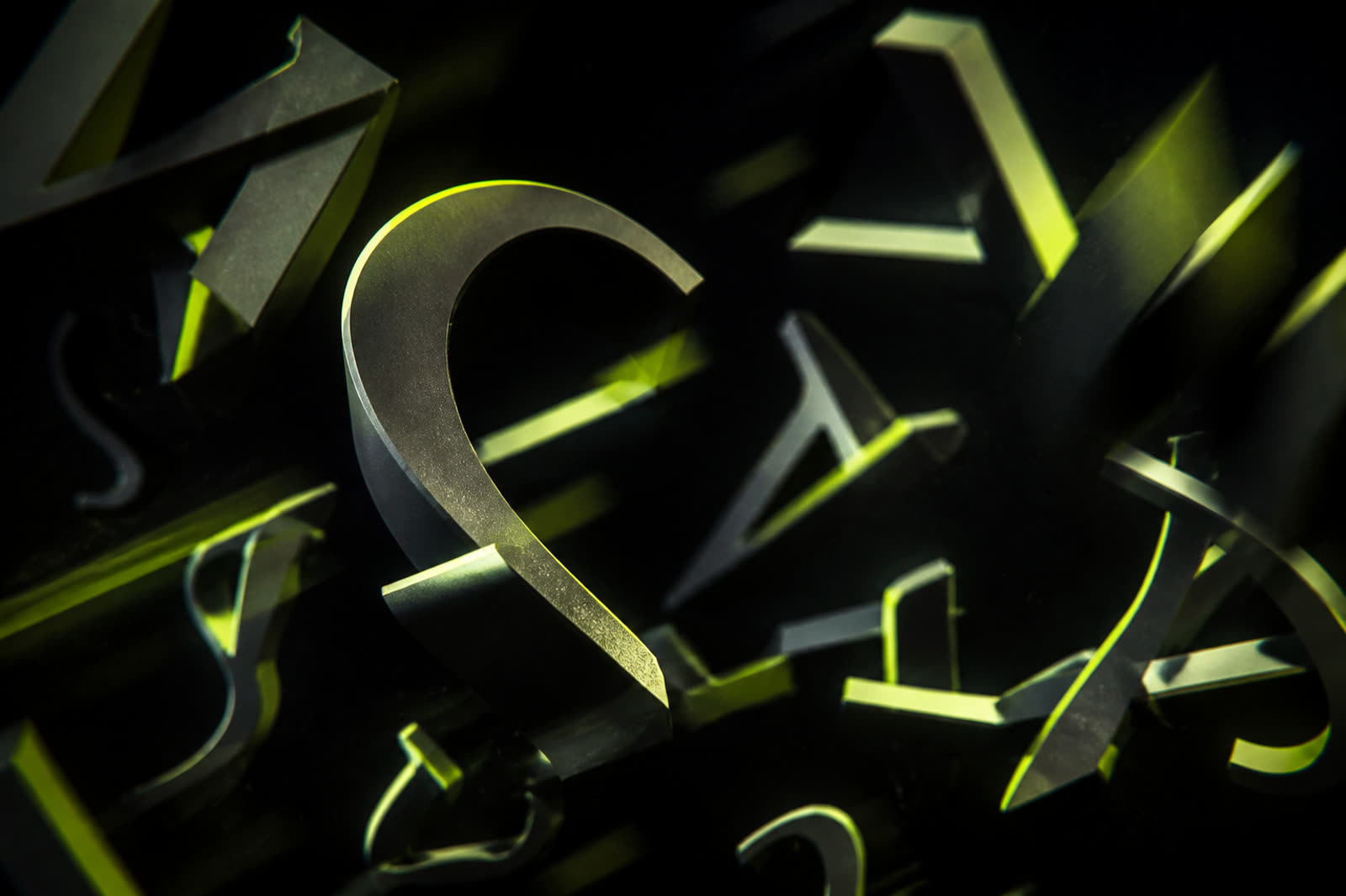
Type in a still poster and type in an intro are different jobs. A thin fashion serif can look expensive on a website hero and disappear the moment it tracks, glows, or sits over footage. Motion adds blur, compression, scaling, and a viewer who may watch on a bus. If the words in your logo animation, tagline, or lower third cannot be read in one second on a phone, they are texture, not language. Choosing fonts for motion graphics starts with readability under stress, then personality. You can still have a distinctive voice. You cannot recover a word that never resolved on screen.
Prefer sturdy weights and generous spacing
Hairline weights fail first. They break on compression, on cheap screens, and inside a glow. For titles that move, start around a medium or bold cut of a well-hinted sans, then add a display face only if it remains clear at small size. Increase letter-spacing slightly when letters will be on screen for less than two seconds. Tight tracking that looks sophisticated in print becomes a smear in motion. Also avoid ultra-condensed styles for taglines; they look sharp in a timeline zoom and collapse in a feed. If you need elegance, get it from proportion and color, not from vanishing strokes.
Test the worst frame, not the prettiest. Pause mid-transition when letters are smallest, brightest, or over the busiest background. If you cannot read the word while squinting, simplify. Put a dark or light plate behind type instead of hoping footage will stay polite. Motion designers often fall in love with the first frame of a type-on. Viewers live in the middle frames, where tracking and blur are strongest. Design for those frames and the open will still look premium.
Limit the family count and match the channel mood
Two type families are usually enough: one for the logo wordmark or display titles, one for supporting lines. A third family in the intro, another in the lower third, and a fourth in thumbnails trains nothing. Match mood across surfaces. A calm teaching channel should not suddenly use a horror display font in the logo sting because a pack was free. If you browse libraries, start with faces designed for screens. Google Fonts at https://fonts.google.com is one place to compare licensed families before you animate them, but licensing for video must still be checked for each file you embed in a commercial channel.
Script and handwritten faces are high risk in motion unless the word is huge and holds still. They also fight Arabic and Latin bilingual layouts if one side is a flowing script and the other is a geometric sans with no shared rhythm. For bilingual branding, choose families with comparable x-height or Arabic weight so both languages feel like one brand. Do not animate each letter of a long Arabic line if the result is a stutter that never forms a word. Reveal by line or by fade more often than by per-glyph gymnastics.
Contrast beats effects, especially on compressed video
YouTube compression is unkind to fine type, neon outlines, and small counters. A lime word on white, or thin white on a bright window, will shimmer. Build contrast with a solid plate, a thicker stroke used sparingly, or a shadow that is wide and soft rather than a hairline outline. Effects that look expensive in After Effects can become crawling edges after upload. Official upload notes at https://support.google.com/youtube/answer/6373554 will not replace a readability test, but they remind you that the file you love is not the file viewers decode. Export a short test, upload unlisted, and watch on cellular data.
Color is part of typography. If your accent is lime, do not set long sentences in lime on mixed footage. Use the accent for a word or an underline and keep body-like lines in white or near-black on a plate. Motion titles are closer to signage than to editorial magazines. Signs work because a few words hit hard. If your intro needs a paragraph, the type system is being asked to do a voiceover’s job. Shorten the line, enlarge the letters, and let sound carry the rest.
Lock a type kit so editors stop improvising
Write down the display font, the support font, minimum sizes for intro and lower third, and forbidden treatments such as extra outlines or random gradients. Include licensed file locations so nobody substitutes a lookalike. When thumbnails, intros, and end cards share type logic, the channel feels directed. If you also publish articles or a site beside the channel, keep the same hierarchy in headings there; consistent public presentation supports trust, including if you later use publisher programs described at https://www.google.com/adsense. Type is not the whole brand, but it is the part viewers try to read. Make that part easy, then make it move.
A practical pass looks like this. Choose one sturdy family for motion titles, one for support, test both on a phone over real footage, export an unlisted upload, and only then add kinetic extras. If a letterform needs particle trails to feel alive, the font was already too weak. Strong type survives still, small, and compressed. That is the font you can safely animate for fifty videos without teaching viewers to skip the words.