
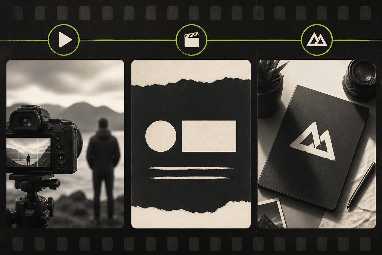
Creators often ask for “a cool animation” without deciding where that animation lives in the video. That is how channels end up with a ten-second intro that viewers skip, an outro that never asks for the next click, or three different logo looks that never become memorable. Intro, outro, and logo sting are related tools, but they serve different jobs. Understanding those jobs helps you build a small identity system instead of collecting random clips.
What an intro is for
An intro answers “whose video is this?” near the start. It should be short, on-brand, and easy to recognize across many uploads. Its primary job is identity, not storytelling. If your content already opens with a strong hook — a surprising claim, a result shot, or a direct question — keep the intro under five seconds or place a lighter branded moment after the hook. A long brand film before value is one of the most common retention leaks on YouTube.
Use analytics to validate length and placement. Watch the first fifteen seconds of retention on recent videos and compare opens that lead with branding against opens that lead with spoken value. YouTube documents audience retention concepts at https://support.google.com/youtube/answer/9314356. The intro that “looks best” in isolation is not always the intro that keeps people into minute one. Treat the intro as packaging that supports the promise of the title and thumbnail.
What an outro is for
An outro lives at the end, where viewers who stayed are warmer leads. This is the right place for subscribe prompts, next-video suggestions, playlist invitations, social icons, and a calm logo finish. Because the educational or entertainment promise has already been delivered, an outro can be slightly longer than an intro without the same retention penalty. Still, clutter hurts. Prioritize one primary action: watch the next video, subscribe, or join a playlist — not five competing asks in four seconds.
Design the outro as a layout system, not a one-off animation. Leave safe space for YouTube end screens and cards so your custom motion does not collide with platform UI. Keep text large enough for phones. Match colors to your channel art so the ending feels continuous with the video rather than like a foreign ad. If you publish both long-form and Shorts, remember that vertical outros need different composition rules; format guidance at https://support.google.com/youtube/answer/6373554 can help you plan compatible masters.
What a logo sting is for
A logo sting, sometimes called a bumper, is a compact brand flash — often two to four seconds — used between segments, before a sponsored block, after a chapter, or as a reusable end settle. It carries less storytelling than a full intro and focuses on the mark itself. Because it is short, it can appear more often without training viewers to skip. It is also useful when you want branding without delaying the first sentence of value.
Think of the sting as the atomic unit of your motion identity. Many creators build the intro and outro from the same visual language as the sting so the whole system feels related. That shared DNA — color accent, reveal style, audio motif — is what makes a channel look coherent even when video topics vary widely.
How to choose what you need first
If you are starting from nothing, prioritize in this order for most channels: one short sting or intro for recognition, then one outro system for conversion actions, then optional variants for vertical platforms. A channel that already has strong cold opens may need only a sting and an outro. A show-style channel with chapters may get more value from stings between segments than from a long cold intro. A brand-new channel with soft openings may benefit from a brief intro that establishes identity quickly.
Avoid collecting every style at once. Three unrelated animations create noise; one system used for months creates memory. Write a one-page rule set: when the intro plays, when the sting plays, how long each lasts, and what the outro asks viewers to do. Revisit the system when analytics show a problem, not when you are bored. Boredom is a creator feeling; confusion is a viewer problem. Optimize for the viewer.
Practical combinations that work well
A common effective package is a three-to-five-second intro, a two-to-three-second sting for mid-video transitions, and a five-to-eight-second outro with one clear next action. Another effective package for educational creators is hook first, sting second, and a structured outro with chapters or a recommended next lesson. Gaming and entertainment channels sometimes prefer an ultra-short sting only, trusting the first gameplay shot to carry energy. There is no universal winner — only fit.
Whatever you choose, keep educational usefulness ahead of decoration. Your motion package should help people recognize you, stay with you, and know what to do next. If an element does none of those jobs, it is probably optional. Build less, reuse more, and let consistency do the quiet work of professionalism over time.
Revisit the package after twenty uploads, not after one bored evening. Look at retention near the open, click-through on end screens, and whether viewers comment that your channel “feels consistent.” Those signals tell you whether intro, outro, and sting are doing their jobs. Adjust duration and placement with evidence. The creators who look polished usually did not buy more animations; they used fewer pieces with clearer roles and stuck with them long enough for memory to form.