
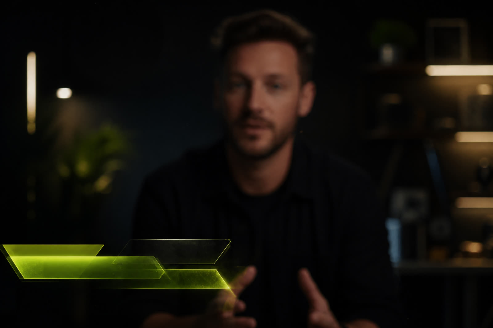
Lower thirds are small, so creators often treat them as decoration: a trendy bar, a glitch, a long job title, and a social handle squeezed into a corner. On a talking-head video the lower third sits near the most important object in the frame, which is the face. If the graphic climbs into the mouth, flashes every ten seconds, or uses type too thin to read, it steals attention from the sentence being spoken. A professional lower third is a labeling tool with brand manners. It should appear long enough to identify the person, match the intro and thumbnail mood, and then either hold quietly or leave. The face remains the hero. The bar is a caption, not a second show.
Keep the bar below the chin and readable in one second
Place the graphic in the true lower third, not across the chest or over the lips. Leave a margin from the frame edge so platform UI and captions do not collide with your type. On mobile, names need more size than you think. Prefer a short name line and a short role line, not a paragraph. If the second line is a website or three social handles, move that information to the description. A lower third that cannot be read in one glance is not informing anyone; it is only proving that a template was applied. High contrast between type and bar matters more than extra ornaments behind the letters.
Safe zones change with aspect ratio. A bar that sits comfortably in 16:9 can cover hands or a product in 9:16, or sit under YouTube’s captioning. When you publish both long-form and Shorts, make two lower-third positions rather than scaling one file blindly. YouTube’s format guidance at https://support.google.com/youtube/answer/6373554 is a practical checklist for which masters you need. Preview the first thirty seconds on a phone with captions on, because many viewers watch that way whether you planned for it or not.
Match color and type to the intro, then stop animating
If the intro uses a lime accent and a bold sans, the lower third should not switch to gold script. Viewers feel the mismatch even if they cannot name fonts. Borrow the accent, the corner radius, and the weight philosophy from the logo settle. Animation should be a short ease-in, not a repeating loop that pulses beside the speaker’s mouth for the whole interview. Once the name is established, hold. Repeating the entrance every time the camera cuts retrains the eye to the graphic instead of the thought. Reserve extra motion for guest changes, not for every jump cut.
Guest videos need a slightly different hierarchy. The host can use a quieter bar because the audience already knows the face. The guest needs a clearer name for longer, especially if pronunciation is unfamiliar. Do not pack both names into one crowded lockup. Sequence them: host first if needed, then guest, then a clean frame. If several experts appear, keep the visual system identical and change only the words. Consistency teaches the audience that the bar is information, not a new effect every chapter.
Avoid fights with captions, hands, and products
Talking-head channels often show a product, a notebook, or gestures in the lower frame. A permanent name bar can hide the very object the sentence is about. Either raise the camera framing so the lower third has empty background, or hide the bar after identification. Captions are another collision: burned-in subtitles plus a lower third plus YouTube’s own captions create a stack of unreadable stripes. Prefer one text system in the picture. If you rely on auto captions, keep the graphic thinner and higher contrast rather than taller.
Review a few recent uploads the way a stranger would. Mute the sound and see whether the name is still clear. Turn sound on and see whether animation distracts from the first answer. Check retention around the moments the bar appears; YouTube’s retention help at https://support.google.com/youtube/answer/9314356 can show whether a flashy entrance correlates with a dip. If you also keep a site for the channel, reuse the same name style in about pages so identity does not split between player and web. Clear public pages matter if you later explore publisher tools such as those outlined at https://www.google.com/adsense.
Make a tiny kit and treat it as part of the brand
A lower-third kit is small on purpose: host version, guest version, maybe a location or series label, plus vertical crops. Include color values, type sizes that survive phones, and a still that shows distance from the chin. Give editors a duration rule, such as four seconds in then hold or hide. Do not let every collaborator pick a new bar from a trending pack. The intro, thumbnail accent, and name graphic should feel like siblings. When they do, talking-head videos look hosted rather than assembled from unrelated stickers.
The test is simple. After the bar has been on screen for two seconds, can a new viewer say the name, and can they still watch the eyes? If the answer is no, reduce type, lower the bar, or kill the loop. Lower thirds are successful when nobody comments on them and everybody still knows who is speaking. That quiet usefulness is the opposite of a graphic that tries to entertain. Let the person entertain. Let the bar introduce, then stand aside.