
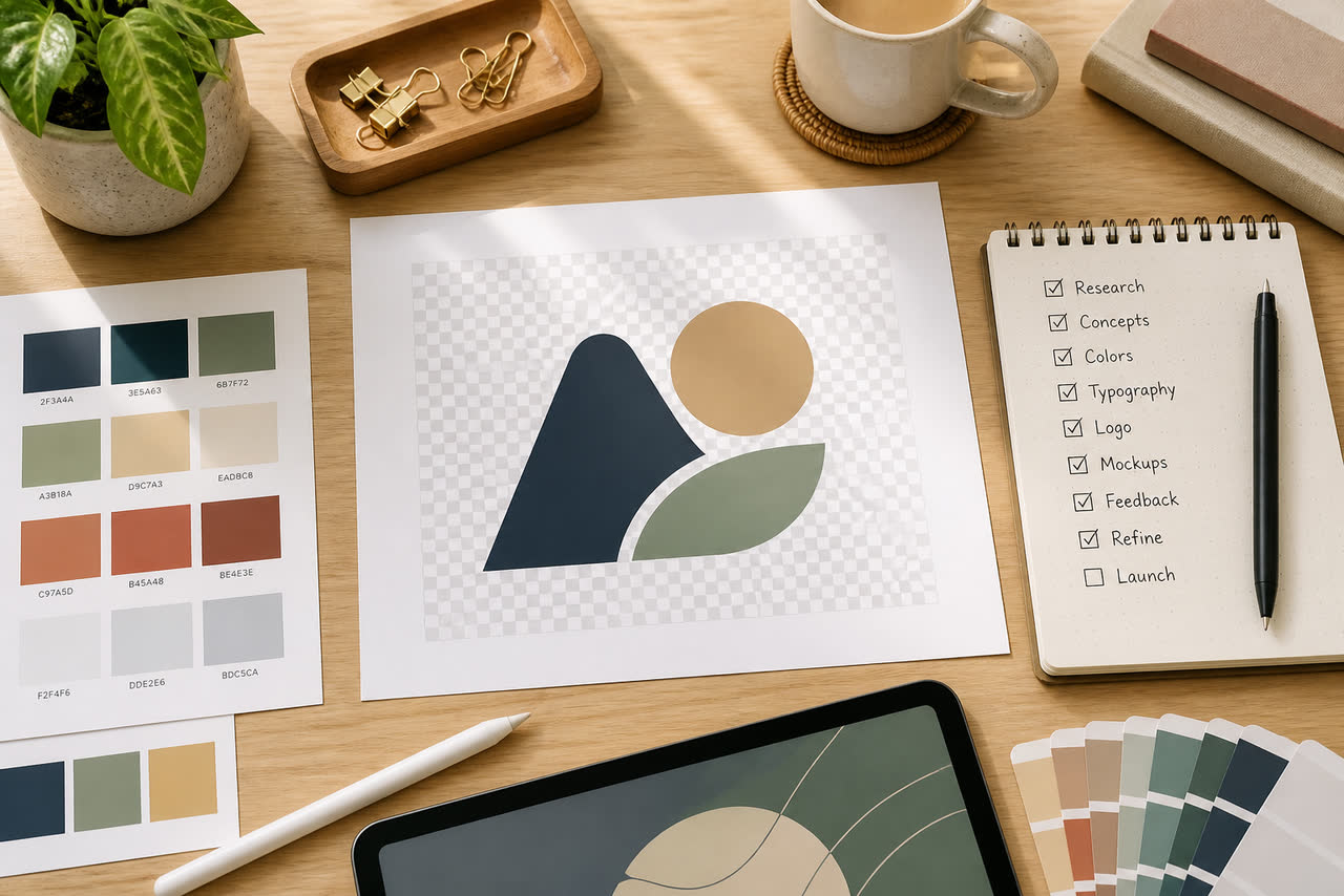
Most delays in custom motion work are not mysterious. They come from low-resolution logos, unclear spelling, vague color notes, missing aspect ratios, or a brief that describes a feeling without describing a use case. Whether you work with a freelancer, a studio, or a template customizer, preparing a clean package up front protects your timeline and your brand. Think of the brief as production design for collaboration: the clearer the inputs, the fewer rounds of “can you send that again?” and the more energy goes into craft.
The logo and brand asset checklist
Start with the mark itself. Prefer a transparent PNG with a high pixel count, or a vector file such as SVG, AI, or EPS when available. Avoid screenshots from websites, compressed social profile crops, or logos flattened onto busy backgrounds. If your logo includes both an icon and a wordmark, send versions that show how they should lock up together and whether the icon can stand alone. If you have dark and light variants, include both so the designer can choose contrast that survives real backgrounds.
Next, write exact on-screen text. Channel names are often misspelled in briefs because people type from memory. Copy the official spelling from your channel settings or website. If you use Arabic and English, specify which language appears in which export, and whether both languages ever share one frame. Include any tagline you want — or explicitly say you want no tagline. Ambiguity here creates redesigns later when type has already been animated.
Colors, fonts, and visual references that actually help
Hex codes beat adjectives. “Blue like the ocean” can mean twenty different values. If you have brand guidelines, extract primary and accent colors. If you do not, sample colors from your current banner and thumbnails so the motion does not fight your existing packaging. Mention colors to avoid as well, especially if a competitor in your niche owns a strong palette association.
Fonts matter when a tagline or channel name is typeset as part of the animation. Share font files when licensing allows, or share the font names used on your site and thumbnails. If you cannot share fonts, say so and ask for a close alternate that remains readable on phones. For references, send two or three examples of pacing and mood you like, and one example of what you do not want. References should describe motion quality — calm, sharp, minimal, cinematic — not a request to copy someone else’s identity.
Aspect ratios, platforms, and technical delivery specs
Decide where the file will live before animation begins. Classic YouTube long-form usually needs 16:9. Shorts, Reels, and Stories usually need 9:16. Some ads and feed placements still use 1:1. Ordering only a widescreen master and later forcing it into a vertical crop often clips logos and taglines. YouTube’s upload and format documentation at https://support.google.com/youtube/answer/6373554 is a solid place to confirm long-form and related requirements while you plan masters.
Specify delivery format early: MP4 is common for editors, sometimes with a transparent WebM or ProRes/QuickTime request when compositing needs an alpha channel. Note resolution targets such as 1920x1080 or 1080x1920, frame rate if your timeline is locked to 24, 25, or 30 fps, and whether you need a silent version plus a version with sound. If your editor uses a particular color space or expects a certain end-card hold length, write that down. Technical clarity prevents last-minute re-exports.
Write a brief that describes use, not only aesthetics
Explain the job of the piece. Is it a cold-open intro, a mid-roll sting between segments, an outro for subscribe prompts, or a reusable bumper before ads? How many seconds can you tolerate on every upload? Will the first line of the video be spoken immediately after, or do you sometimes place a hook first? These answers change pacing more than any adjective about “premium” or “epic.” Also describe your niche and audience so motion energy matches trust expectations.
Include constraints and non-goals. Examples: no tiny text, no more than one accent color, no camera shake, no slogan, keep under five seconds, prioritize mobile readability. Non-goals save time because designers stop exploring directions you would reject anyway. If you have legal or trademark considerations around how the mark may be altered, state them. Some brands forbid stretching, recoloring, or separating icon and wordmark.
Review process and how to give useful feedback
Agree on review rounds before work starts. A common healthy pattern is one direction pass, one refinement pass, and one final polish for typography and audio. When you give notes, timestamp them and be specific: “logo too small from 0:02–0:03,” “accent color clashes with banner blue,” “audio peaks louder than my voice.” Avoid vague notes like “make it pop” without saying what should change. Watch previews on a phone, not only on a large monitor.
Finally, archive the approved master files and a short note about where they should be used. Future you will thank present you when a new editor joins or when you launch a second channel variant. If your broader content operation includes a website that may later use display ads, keep ownership and policy pages equally organized; Google outlines its publisher program at https://www.google.com/adsense. For motion projects, though, the immediate win is simpler: a complete file pack and a precise brief turn custom work from a guessing game into a controlled collaboration.
A strong prep habit also protects your taste. When assets and decisions are ready, you spend review time judging craft — pacing, contrast, readability — instead of hunting missing files. Create a reusable folder template with subfolders for logo, fonts, references, and delivery notes. Drop every future project into that structure. Over months, this becomes part of your creative operations, and collaborators can join without decoding tribal knowledge stored only in chat history.