
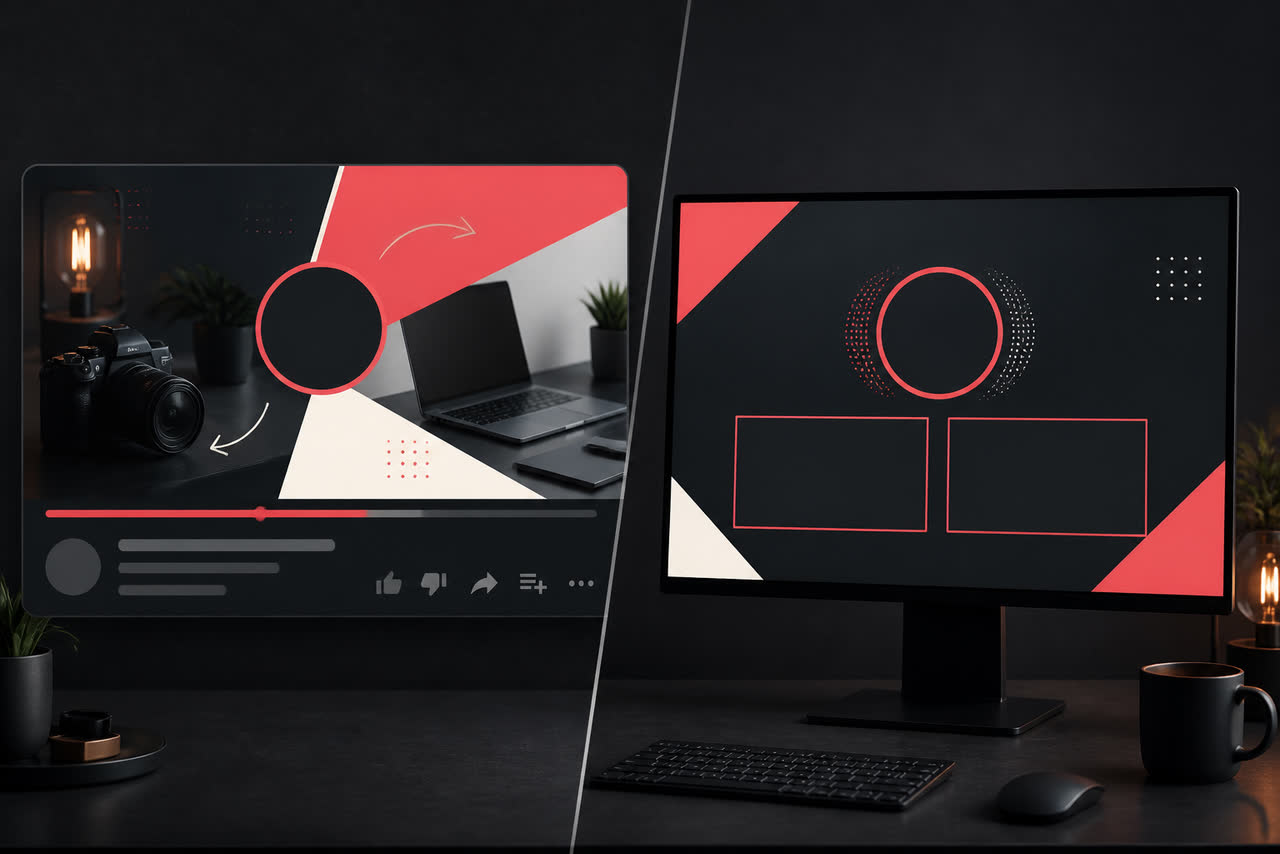
Thumbnails and intros are two doors into the same channel. If the door on the home feed uses neon yellow, chaotic type, and a shocked expression, while the intro that plays after the click uses muted blues, elegant serif titles, and a calm logo settle, viewers feel a mismatch even before your first sentence. That mismatch costs trust. People came for the promise of the packaging; the branded open should continue that promise, not introduce a second personality. Visual consistency between thumbnail and intro is one of the simplest ways to make a channel feel coherent without changing your content strategy.
Align color accents across the click and the open
Pick the same primary accent for thumbnail highlights and intro end frames. If your thumbnails always use a coral bar behind key words, let that coral appear as a thin underline or glow restraint in the logo settle, not as an unrelated purple particle field. Limit the accent count so recognition can happen at a glance. When every upload invents a new rainbow, neither the thumbnail system nor the intro system can teach memory. A shared palette also helps series packaging: viewers learn that a certain color family means your show, not a random trending template.
Test the pair together. Export a thumbnail and the intro end frame, place them side by side on your phone, and ask whether they look like siblings. If one feels loud and the other feels corporate, revise until the emotional temperature matches. This test catches problems that separate design reviews miss, because thumbnails are judged in feeds while intros are judged in players. YouTube’s guidance on formats and uploads at https://support.google.com/youtube/answer/6373554 is useful when you also reuse the same identity in vertical crops where accents can get clipped.
Keep typography mood consistent, even when layouts differ
Thumbnail type is usually bolder and shorter than intro type, but the mood should still match. A channel that uses friendly rounded sans in thumbnails should not suddenly switch to gothic metal lettering in the intro settle. Choose one display family and one supporting family for both surfaces when possible. Match weight and contrast philosophy: high-impact block letters in both places, or softer editorial titles in both places. Viewers may not name the font, but they feel when packaging and branding disagree.
Decide face versus logo hierarchy before you design
Many successful thumbnails lead with a face and emotion, while intros lead with a logo. That split can work if the hierarchy is intentional. Use the face to win the click, then let the logo confirm whose video it is within a few seconds. Problems start when the thumbnail also packs a huge unfamiliar logo lockup that fights the face, or when the intro hides the logo behind effects until nobody can read it. Write a simple rule: thumbnail hierarchy is face then short text; intro hierarchy is logo then optional three-word line. Rules like this prevent accidental competition between recognition systems.
Avoid mismatches that confuse subscribers who already know you. If your community recognizes a calm host face and clean type, a sudden clickbait collage followed by a luxury cinematic open can feel like bait and switch. Loyal viewers are patient with experimentation in content, but packaging that lies about tone creates skepticism. If you study whether early seconds help or hurt, retention graphs are your friend; YouTube explains how to read them at https://support.google.com/youtube/answer/9314356. Compare uploads where thumbnail and intro share accents against uploads where they diverge, and let the data challenge your taste.
Always test the system on a phone
Most viewers meet your thumbnail on a small screen and may watch the intro on the same device. Zoom out until the thumbnail is roughly feed size and ask whether the accent and face still read. Play the intro and pause on the end frame; ask whether the logo is readable in one second. If either side fails on mobile, desktop polish does not matter. Also check Safe zones for Shorts and vertical reuse so your consistent accent color does not sit under interface chrome. A brand system that only works on a laptop preview is not a YouTube brand system.
When the thumbnail and intro finally feel like one composition language, freeze the rules for a meaningful run of uploads. Put accent hex values, font names, face-versus-logo notes, and approved intro masters in one kit. Share that kit with editors so each new video does not reinvent packaging. If you later add a website around the channel, keep the same visual cues in headers and about pages; clear, consistent presentation also matters if you explore publisher tools such as those described at https://www.google.com/adsense. Consistency is not rigidity for its own sake. It is how subscribers learn that the promise they clicked is the channel they entered. Keep this system boring on purpose: boring means searchable files, predictable folders, fewer revision loops, and a brand that still looks like itself after fifty uploads. Review the kit every quarter, not every week. Update only when a real identity decision has changed, then replace the master files and tell collaborators which version to use. Over time, this quiet discipline becomes part of how your audience recognizes you, which is the real job of branding for video creators.