
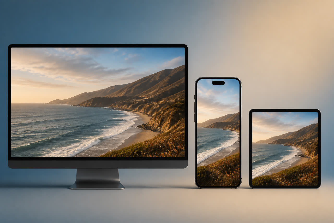
Aspect ratio is not a technical footnote. It decides whether your logo stays readable, whether captions fit, whether faces are cropped, and whether platform interface elements cover your hard work. Creators who animate first and crop later often discover that the hero of the composition — the mark, the tagline, or a key product — sits under a username, a like button, or a safe-zone cut. Choosing the frame before motion design saves revisions and protects branding across YouTube, Shorts, Reels, Stories, and ads.
16:9 — YouTube long-form and landscape viewing
Use 16:9 for classic YouTube uploads, website embeds, presentations, and most desktop viewing. Centered logo reveals, wide cinematic scenes, and side-by-side comparisons thrive in this frame. Because landscape gives horizontal room, you can place a wordmark beside an icon more comfortably than in vertical video. Still, design for the smallest common playback size, not only a large monitor. Many people watch long-form on phones in landscape or letterboxed portrait modes.
When preparing masters for YouTube, confirm upload expectations and format options in the official help documentation at https://support.google.com/youtube/answer/6373554. A clean 1920x1080 master remains a practical default for many channels, while higher resolutions can help if your channel regularly benefits from sharper detail. Whatever resolution you choose, keep critical branding away from extreme edges so compression and player UI do not nibble at your mark.
9:16 — Shorts, Reels, Stories, and full-phone frames
Vertical 9:16 fills modern phone screens. That immersion is powerful, but platform UI is aggressive. Usernames, captions, buttons, progress bars, and reply fields can cover lower thirds and side edges. Keep logos and taglines inside a safer center band, and avoid placing essential text where captions usually run. Motion that looked elegant in 16:9 can feel cramped after a naive center crop; rebuild composition for vertical instead of forcing a landscape file into a tall window.
Vertical intros and stings should be even more economical with words. A tagline that fits under a wide logo may wrap awkwardly in 9:16. Prefer fewer words, larger type, and stronger contrast. If you publish the same campaign to YouTube Shorts and other vertical platforms, test on-device before finalizing. What is readable in an editing timeline preview may fail under real overlay chrome.
1:1 — feeds, profile grids, and some ad placements
Square 1:1 remains useful for certain feed ads, carousel units, and profile-grid aesthetics. It is a compromise frame: more vertical presence than 16:9, less immersive than 9:16. Use it when a platform or media plan truly requires it, not because it feels like a convenient middle. In square compositions, center the mark and keep supporting text minimal. Busy corners are risky because different apps crop or pad squares differently.
If your workflow includes paid amplification later, confirm placement specs before locking masters. A square that works in one ad manager may be rejected or auto-cropped in another. Building from a clear primary ratio and deriving secondary ratios with intentional redesigns is safer than hoping one file survives every crop.
Safe zones, captions, and multi-platform packaging
Safe zones are imaginary margins that keep critical content away from edges and UI. For branding motion, treat the logo end frame as sacred: it must remain fully visible and high-contrast inside the safe zone of every target platform. Captions are part of modern viewing, especially on mute. Leave space for burned-in captions or for platform caption overlays so your tagline and captions do not collide. If your audience is bilingual, plan whether Arabic and English captions need different vertical room.
A practical packaging strategy is to choose one hero ratio for your main channel and one secondary ratio for short-form distribution. Design both from the same visual language so recognition survives the crop. Then export purpose-built masters rather than relying on automatic reframing. Automatic tools can help for rough cuts, but logo lockups deserve human composition decisions.
How aspect ratio choices affect branding and retention
When a logo is clipped or unreadable, branding fails even if the animation is beautiful. When an intro feels awkwardly cropped, viewers may bounce in the first seconds for reasons that look like “topic mismatch” in your head but are really presentation friction. Pair ratio decisions with retention review. YouTube’s audience retention guidance at https://support.google.com/youtube/answer/9314356 helps you connect early drop-off to packaging choices, including opens that fight the frame.
If you also maintain a content site, keep media standards equally intentional there. Clear pages and consistent assets help readers and can matter if you later explore publisher monetization programs such as the one described at https://www.google.com/adsense. For video creators, though, the immediate lesson is concrete: pick the frame for the platform, protect the safe zone, and build motion that remains legible where people actually watch — which, more often than not, is a phone in someone’s hand.
Make ratio decisions part of your pre-production checklist, not an export afterthought. Before you animate a logo settle or film a talking-head open, write the destinations: long-form YouTube, Shorts, Reels, Stories, or paid placements. Then commission or design masters for those destinations only. Creators who skip this step pay later in cropped wordmarks, clipped icons, and awkward black bars. A few minutes of framing discipline at the start protects weeks of editing later, and it keeps your brand looking deliberate everywhere it appears.