
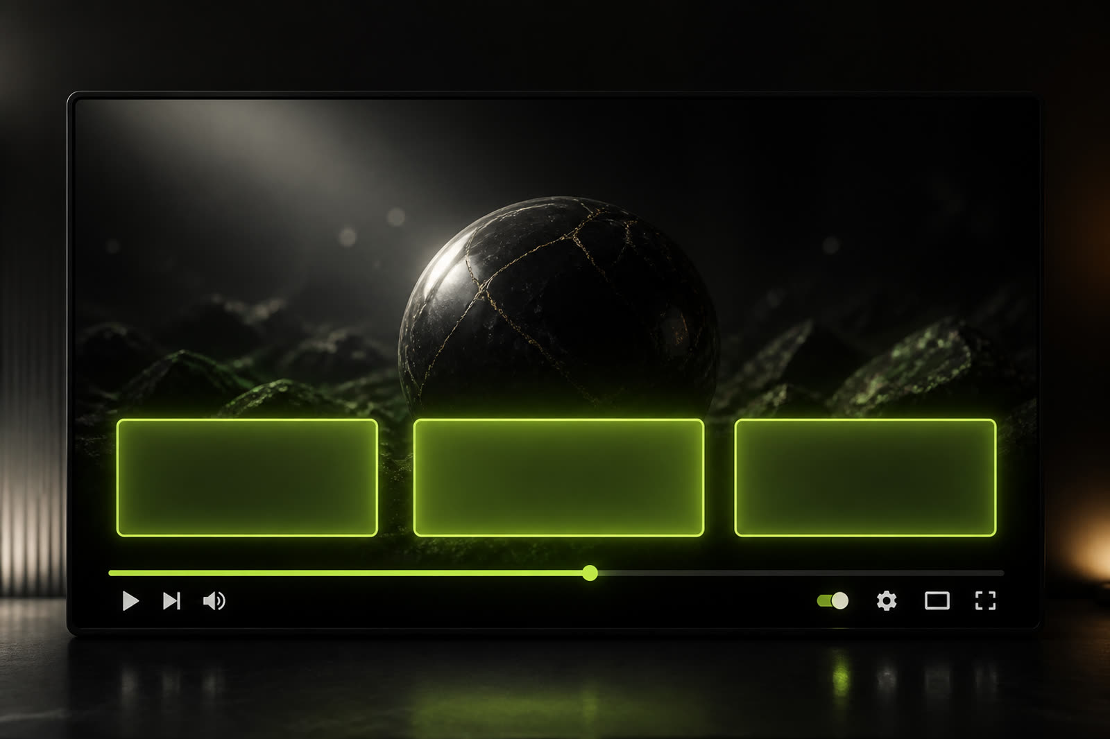
Many creators treat the last twenty seconds of a video as leftover space: a logo animation, a subscribe burst, and whatever YouTube cards happen to cover. Viewers experience those seconds as one moment. If a cinematic outro fills the frame with particles while end-screen elements sit on top, the cards become unreadable and the brand becomes noise. If the last frame is empty because you were afraid of covering artwork, the video dies without a next step. The professional approach is to design the outro as a layout that reserves room for YouTube’s interactive elements instead of fighting them. Branding and navigation can share the same ending when you plan the composition before you animate.
Separate the jobs: branding versus the next click
An outro answers identity: whose video was this, how should it feel as it closes, and what visual memory should remain. An end screen answers behavior: watch this next, subscribe, visit a playlist, or open a related video. When both jobs compete in the same pixels, both fail. Keep the logo, color, and sonic sting in a stable zone, usually a corner or a slim lower band, and keep the center and one side quieter so cards can land. YouTube documents how end screens work, including timing and element types, at https://support.google.com/youtube/answer/2972003. Read that page before you lock a twelve-second hero animation that leaves no safe rectangle.
A useful rule is to finish the logo settle before the last five to eight seconds, then hold a clean layout while cards appear. Motion can continue as a slow drift, a soft glow, or a looping background, but the composition should stop rearranging. Cards need a predictable home. If your subscribe burst explodes across the whole frame at the exact moment YouTube draws a subscribe element, you have two subscribe messages and no clear next video. Pick one primary action for the human eye and let the platform handle the rest with official elements.
Leave a quiet rectangle and test it on a phone
End-screen cards are rectangles. Designers forget this because they animate circles, particles, and 3D cameras. Build a template frame with two or three placeholder boxes in the positions you actually use in YouTube Studio, then animate around those boxes rather than through them. Keep contrast high inside the reserved zones: mid-gray smoke behind a mid-gray card is a common failure. A dark, simple field or a slight dimming of the last shot often reads better than a dense motion graphic. Test on a phone because most viewers will see cards at a fraction of your timeline preview size.
Vertical uploads and horizontal uploads need different reserved maps. A 16:9 outro that looks elegant on desktop can bury cards under interface chrome when cropped for Shorts, or it can leave a huge empty sky if you only scale the same file. Maintain two masters when you publish both formats: one landscape layout with cards on the right or lower third, and one vertical layout with cards stacked where thumbs can reach them. Official notes on upload formats at https://support.google.com/youtube/answer/6373554 help you list every version you must keep in the brand folder.
Time the sting so it does not mask the cards
Audio is part of layout. A loud whoosh at the exact second cards appear trains people to look away from the clickable area. Place the sonic logo earlier, under the spoken call to action, then let the last seconds sit at dialogue level or slightly below. If you ask viewers to watch the next episode, say the title while the matching card is visible, not while the logo is still tumbling. Spoken direction plus a readable card is more effective than a generic please subscribe shouted over a kaleidoscope.
Watch retention on the ending the same way you watch the open. If people leave the moment branding starts, the close is too long or too disconnected from the topic. YouTube explains audience retention graphs at https://support.google.com/youtube/answer/9314356. Compare videos where you hold a still layout behind cards with videos where animation keeps peaking until the last frame. The quieter hold usually wins clicks even if it looks less spectacular in isolation on an editor’s monitor.
Build one outro kit and reuse it for fifty uploads
Do not invent a new ending every week. Recognition at the close is as useful as recognition at the open. Create a short family: a five-second logo settle, a ten-to-twenty-second card bed with reserved boxes, a subscribe sting that never covers the next-video slot, and optional playlist artwork that matches your thumbnail system. Name the files clearly, store them with the rest of the brand kit, and give editors a still frame that shows where cards belong. If you later add a website around the channel, keep the same colors and end-frame mood on about pages so public identity stays aligned; Google’s publisher overview at https://www.google.com/adsense is a reminder that clear presentation supports trust outside the player too.
A strong outro is not the most decorated last shot. It is the last shot that still looks like you after YouTube draws its cards. Design the quiet rectangle first, time the sting so speech and clicks can coexist, keep one layout for a long run of uploads, and only then add motion that reveals the mark. Viewers should leave knowing whose video they watched and what to open next. If they only remember sparks, the ending did branding theater instead of branding work.