
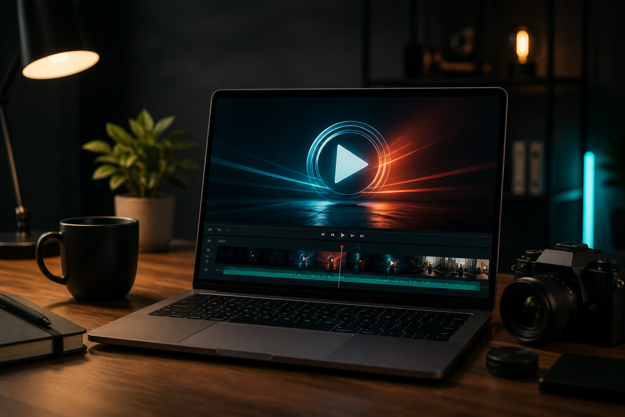
Your YouTube intro is often the first branded moment a returning viewer recognizes, and it can also be the first impression a new viewer gets after your thumbnail and title did their job. Done well, it answers a simple question in a few seconds: whose video is this, and what kind of experience should I expect? Done poorly, it becomes a ritual that trains people to skip, mute, or leave before your real content begins. The goal is not to impress other creators with particle effects. The goal is to make your channel feel intentional, consistent, and easy to remember without stealing attention from the story you came to tell.
Start with niche, tone, and audience expectations
Before you look at styles, write down three practical facts: your niche, your typical viewer, and the emotional temperature of your videos. A fitness channel often benefits from clear energy, bold type, and motion that feels athletic without becoming chaotic. A history, documentary, or education channel usually needs slower pacing, richer atmosphere, and typography that feels trustworthy. A tech review or gaming channel can handle sharper cuts, higher contrast, and more modern transitions. A soft lifestyle or personal brand channel may want warmer color, gentler motion, and a calmer end frame. Matching niche first prevents the common mistake of choosing the flashiest option and then wondering why it feels disconnected from the first minute of speaking.
Audience expectations matter as much as niche labels. If your community comes for fast tips, a long cinematic open can feel like friction. If your audience treats your channel like a weekly show, a short recognizable identity can feel welcoming. Think about how people watch you: phone speakers on mute with captions, desktop with headphones, or background listening while cooking. An intro that relies on tiny text, dense effects, or quiet detail will fail on small screens. An intro that screams louder than your voice will also fail, because viewers calibrate volume to your speaking level and then get startled by a brand sting that peaks too hard.
Keep it short, readable, and repeatable
Most creators do best with three to eight seconds. That range is long enough for a logo to land and short enough that loyal viewers do not resent seeing it again. Design for recognition, not for a mini trailer. A centered end frame with limited color accents usually works better than a busy collage of icons, slogans, social handles, and animated backgrounds competing for attention. If you need a tagline, keep it to a few words and make sure it remains legible at phone size. If your logo has fine detail, simplify the motion so the mark stays sharp rather than dissolving into particles or glare.
Repeatability is a branding advantage. When the same intro appears across uploads, viewers form a memory link between motion, sound, and your name. Changing the intro every week may feel creative to you, but it resets that memory for everyone else. Treat updates like identity changes: do them when your logo, name, or positioning actually changes, not whenever a trend appears on social media. Consistency also helps your channel feel like a product with standards, which matters if you later grow into series, memberships, or brand partnerships.
Use YouTube’s own tools to judge whether the intro helps
Do not guess from vibes alone. Open YouTube Analytics and study audience retention on several recent uploads, especially the first fifteen to thirty seconds. Look for a sharp early drop that lines up with a long open, a loud sting, or a delayed hook. YouTube explains how to read audience retention and related metrics in its creator help center at https://support.google.com/youtube/answer/9314356. Compare videos where you start with a spoken hook before branding against videos that begin with a full intro. The better pattern is the one that keeps people through the promise of the video, not the one that looks more expensive in isolation.
Also check how your uploads behave on mobile. Many viewers never see your carefully designed wide composition the way you previewed it on a laptop. Test a finished intro on a phone, pause on the end frame, and ask whether the logo is instantly readable. If you publish Shorts as well as long-form, remember that vertical framing and UI overlays change what is safe. Official guidance on uploading and format choices is available at https://support.google.com/youtube/answer/6373554. Choosing a style that survives both landscape and vertical reuse will save you from awkward crops later.
Decide where the branded moment should live
Not every video needs the same structure. If your content already opens with a strong cold open — a surprising line, a result, a question, or a clip of the payoff — place a lighter logo sting after that hook instead of forcing a full intro first. If your videos are calm and educational, a brief identity at the start can set the tone without delaying value. If you run a show format with recurring segments, a short sting between chapters may do more branding work than a long cold open every time. The best intro strategy is the one that supports retention and recognition together.
Sound design deserves the same care as visuals. A rising whoosh that peaks above your dialogue will train viewers to lower volume or skip. Prefer a sting that sits under or beside your usual speaking level. If you use music beds in videos, make sure the intro key and energy do not clash with the first thirty seconds of content. Silence can also be a branding tool: a clean logo settle with a soft hit often feels more premium than a dense soundscape fighting for space.
Prepare clear brand assets before you commission motion
Great motion cannot rescue unclear inputs. Gather a transparent logo PNG or vector file, exact spelling of your channel or brand name, preferred brand colors in hex if you have them, and any optional tagline you truly want on screen. Decide whether you need landscape masters, vertical masters, or both. Note whether the piece will be used as an intro, an end card, a mid-video sting, or all three with slight timing differences. Clear assets make revision cycles shorter and protect the readability of your mark.
Finally, judge candidates with a creator checklist rather than a beauty contest. Ask: Does this feel like my niche? Can I read the logo on a phone in one second? Is the length short enough that I will still like it on upload number fifty? Does the audio sit comfortably under my voice? Does the end frame leave room for the first sentence of the video? If you can answer yes, you have an intro that serves branding without sabotaging attention. That balance is what makes a YouTube identity feel professional over months, not just impressive for one afternoon of editing.
Treat your intro library like a small operating system for the channel. Keep one approved master, one vertical variant if you publish Shorts, and a written note about when each plays. When a collaborator joins, hand them that package instead of asking them to invent a new open from memory. Over a year of uploads, this discipline compounds: viewers learn your cue, editors waste less time, and you avoid the slow drift where every video looks slightly different for no strategic reason. Branding on YouTube is rarely one dramatic reveal; it is hundreds of quiet, consistent seconds that teach people who you are.